Last Updated on November 5, 2023
Cédric Scherer can tell you exactly which country produces the finest coffee. In fact, he can give you the top 10…in order.
He must be quite a coffee connoisseur, right?
Nope. Hardly touches the stuff.
Scherer is a data analyst who dabbles in graphic design. He recently came across an interesting set of data that contained the scores professional coffee tasters had given to hundreds of coffees from all over the world.
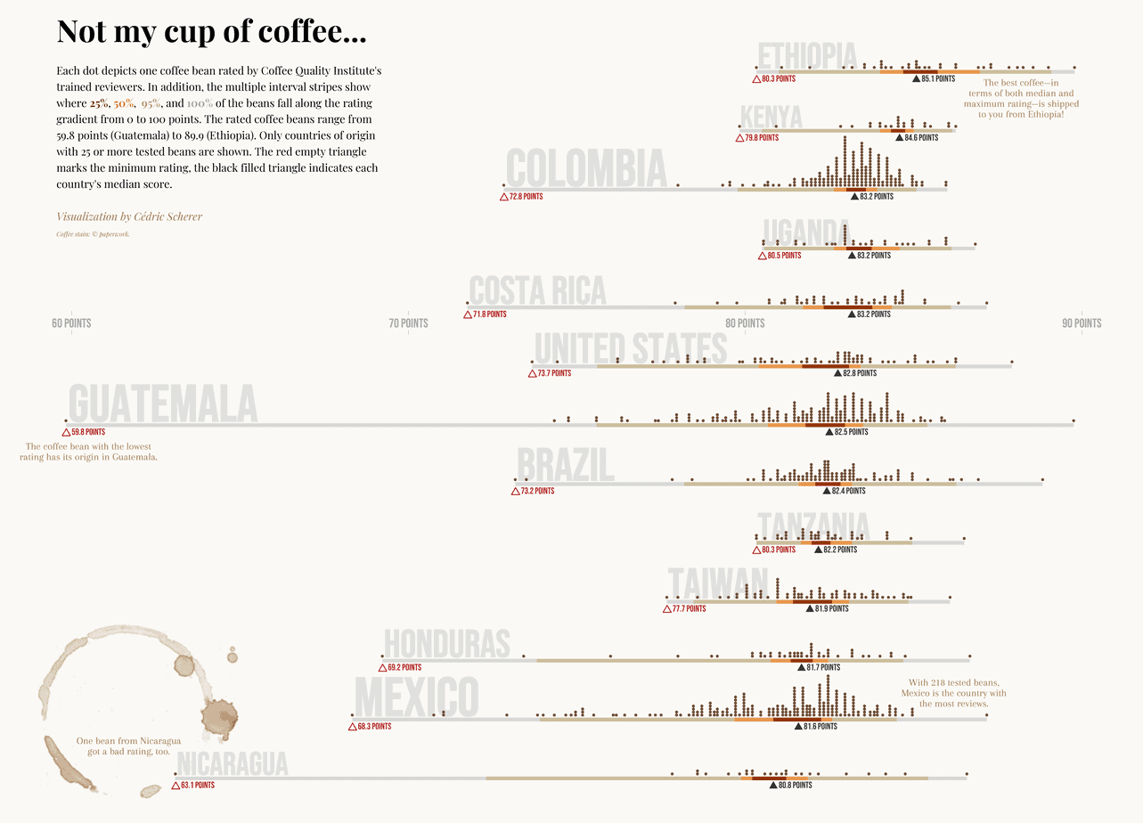
Scherer went to work and produced a graphic that lets you see the results at a glance. Each coffee is represented by a dot along a horizontal axis that corresponds to the rating scale out of 100. By looking at where the dots stack up, you can see how most of the coffees were rated, and the distribution of ratings.
Click on the image below to enlarge the visualization and read it more easily.
We asked Scherer to tell us more about the project.
What inspired you to put this visualization together?
CS: I created this visualization as a contribution to the “#TidyTuesday” challenge, a weekly social data project that focuses on data analysis and visualization using the programming language “R.”
Rating data is often skewed because many values fall into one extreme and, as is the case here, the summary statistics do not tell much. So I decided to depict each rating and to focus on the extreme values in addition.
What’s your background in data and data visualization?
CS: I am a trained computational ecologist so I worked a lot with different tools and datasets during my studies, but I also always had a sense for good design, color and font choices.
When starting my PhD, I found the “ggplot2” plotting library and started diving into it. Three years later, after finishing my PhD, I was completely sold on data visualization and I started participating in challenges and spent most of my time learning the theory and practice of data visualization. By now I have a portfolio of roughly 100 personal projects.
In retrospect, it makes perfect sense that I match my analytical, scientific knowledge with my preference for design. I am so glad I can combine the two to follow my passion.
How would you describe your own level of coffee connoisseurship?
CS: Ehem… I am not really a coffee drinker (laughing) so I guess my level of coffee connoisseurship is pretty low.
Your graphic depends on ratings from the Coffee Quality Institute. What can you tell us about how that rating system works?
CS: The CQI is a non-profit organization with the main goal to offer training and technical assistance to arabica and robusta coffee producers, and other individuals in the supply chain. Their professional reviewers also grade coffee samples from around the world in a consistent and professional manner in terms of aroma, flavor, aftertaste, acidity, balance, and more.
Where did you find the data you needed to do this?
CS: The data collection with 1,340 coffee reviews up to January 2018 is freely available thanks to James LeDoux, who harvested the data from the CQI home page. Since I did not scrape any new data, this visualization does not show ratings since February 2018.
Vietnam produces the second-most coffee after Brazil, yet doesn’t appear here. Why is that?
CS: For the visualization, I decided to keep the countries for which I had 25 or more reviews. I also created an extended version showing the countries with 15 or more reviews but even in that list Vietnam does not appear. For reasons I can only speculate about, the dataset contains only eight ratings for coffee beans from Vietnam. One explanation could be simply the choice of beans by the CQI. Another is that the dataset might be incomplete.
Are there any other notable countries that didn’t make the cut?
CS: Countries that appeared in the extended versions—countries with 15 to 24 coffee bean ratings—are El Salvador, Indonesia, Thailand, and China. The highest median can be found for Papua New Guinea, but it also had only one review. That is slightly better than the median for coffee from Ethiopia.
What did this data reveal that was particularly surprising to you?
CS: I personally found it interesting to see China ranked on the fifth place in my visualization, but as mentioned I am not a coffee expert. Also, I never thought about the U.S. producing coffee! And it turns out most of the rated beans are produced in Hawaii (68 in Hawaii versus 10 in the rest of the U.S.), a fact I didn’t know either.
What other interesting findings do you feel this graphic highlights particularly well?
CS: As mentioned, rating data is often a bit difficult to handle and visualize. What does it tell you about reviews in general and CQI coffee ratings in particular? Well, we can see that most of the beans are graded around 80 and 85 points (overall median is 82.5) and there are rarely extreme outcomes. Given that the points range from 0 to 100 it is also spectacular that the lowest rating is only 59.8 points. The technique of visualizing each review score allows us to get a sense where the data falls and which ratings really mean a coffee bean is better than average.
How many cups of coffee did you consume in creating this visual?
CS: I am usually coding these personal projects during the evenings and nights and I can’t sleep with too much caffeine in my veins. So I have to disappoint you: zero cups of coffee.
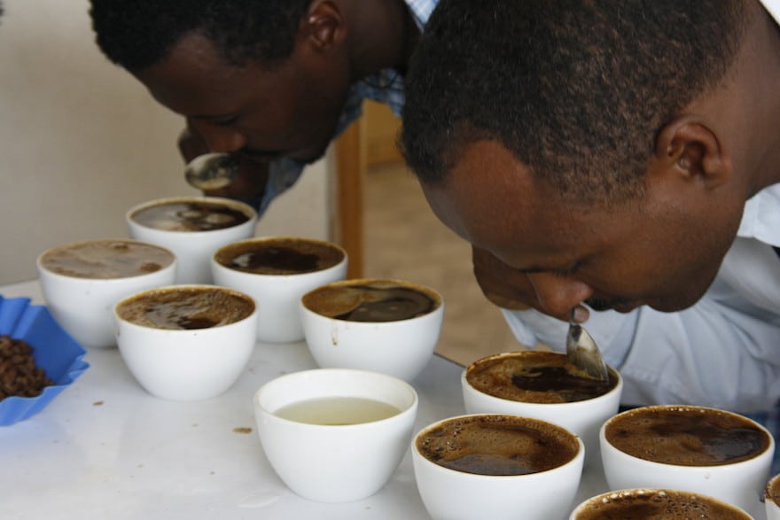
Photo at top: © David Joyce | Creative Commons